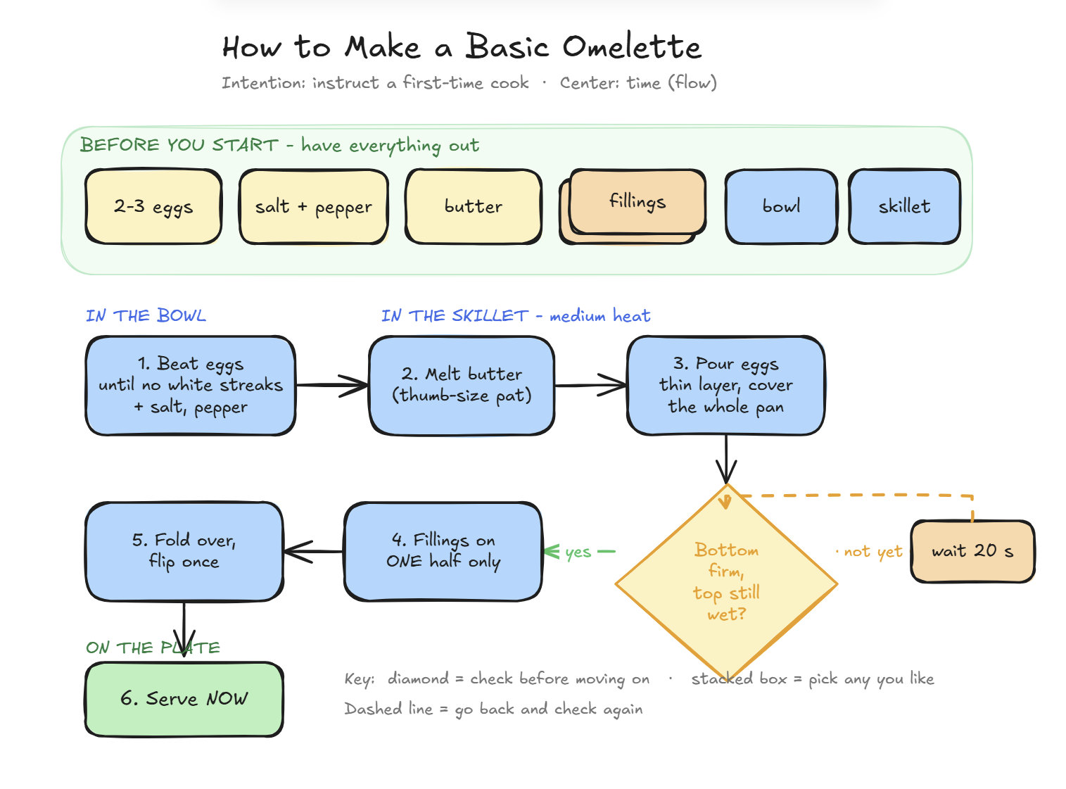
I drew an omelette recipe this week. Six boxes, one diamond, a handful of arrows. It took ten minutes, and it explained something about business process mapping that I had been doing by instinct for a year without being able to say out loud.
The exercise comes from Abby Covert's short book Stuck? Diagrams Help. She gives you a plain recipe and one instruction: make a diagram that helps someone who has never cooked tackle it. Then she asks four questions. Should the diagram center time, arrangement, or context? How do you show the ingredients and equipment? How do you visualize the process? Which parts need words, and which can be visual?
Those are the same four questions I now ask before I map any business workflow. Here is how I answered them for the omelette, and why it matters if you are thinking about automating anything in your company.
The three decisions nobody sees
Covert's first point is that every diagram has visible parts (shapes, lines, labels, a key) and invisible parts: the decisions you made before you drew anything. People who start with the shapes produce diagrams that look fine and help nobody. So before touching a pen, three decisions.
Intention. What should happen after someone looks at this? For the omelette, the intention is instructing: a person follows it and ends up with food. That one word shapes everything after it. Every box has to be an action, not a description.
Audience. Who is this for, and what do they already know? A first-time cook does not know what "set" means, how much "a pat of butter" is, or whether to flip once or three times. They do know what an egg, a bowl, and a pan are. So the diagram spends its words on the first group and none on the second.
Scope. What am I deliberately leaving out? Where to buy eggs, which fillings are good, how to clean the pan. The diagram starts at raw eggs and ends at a plate. Everything outside that line is somebody else's diagram.
In a business, these three decisions are the difference between a process map that sits in a drawer and one that gets a problem fixed. Intention: do I want the owner to see where the time goes, or to do something differently? Audience: is this for the person who does the task every day, or for a manager who has never done it? Scope: one process, start to finish, not "how the office works."
Time, arrangement, or context: what is the diagram about?
This is the question that stopped me, because I had never asked it consciously. Covert says every diagram centers one of three things, and the choice decides what kind of diagram you draw.
Time answers when and how. Steps, sequence, hand-offs. Flow diagrams, swim lanes, journeys, Gantt charts.
Arrangement answers what and where. How parts fit into a whole, what belongs under what. Hierarchies, block diagrams, schematics.
Context answers why and which. Cause and effect, trade-offs, comparisons. Quadrants, continuums, Venn diagrams.
An omelette recipe is six steps in order with one judgment call in the middle. The cook needs to know what to do after what. That is time, so the diagram is a flow. If there were two people in the kitchen handing things to each other, it would be a swim lane: a column per person, arrows across the columns at every hand-off.
Why this matters for process mapping: most business problems people bring me are described as arrangement ("our system doesn't talk to our other system") or context ("we need AI"). Almost all of them turn out to be time problems once you draw them. Something waits. Something gets handed off and dropped. Something is checked too late. You only see that when the diagram centers time, which is why I now start nearly every discovery with a flow or a swim lane, as it is today, before anyone talks about how it could be.
Ingredients and equipment: people, places, things
Before drawing a single box, Covert has you list three things. For the omelette:
- People: one cook. One role means no swim lanes, and the person does not even need a shape.
- Places: the bowl, the skillet, the plate. Three places the eggs move through.
- Things: two or three eggs, salt, pepper, butter, fillings, something to whisk with, something to flip with.
How do you show the ingredients to a beginner? Not as a list at the bottom. As a container at the top labelled Before you start, with every ingredient and tool inside it. This is the "this is part of that" arrangement: small shapes inside a bigger one. A first-time cook fails most often by turning on the heat and then discovering there is no butter. The diagram makes "have everything out" the first thing they see.
In a business process, the same list is the first thing I write down. People: who touches this? Places: which inbox, which system, which spreadsheet, which desk? Things: what document, what data, what approval? If I cannot fill in that list, I do not understand the process yet, and the diagram will tell me so by having gaps in it.
Choosing shapes: when to use a diamond, a stack, a rectangle
Covert's rule is a short sequence of questions, in this order:
- Is it a decision? Use a diamond.
- Is it many of the same kind of thing? Use a stack (two shapes offset behind each other).
- Is the label long? Use a rectangle.
- Otherwise, a square or circle is fine.
The omelette has exactly one decision: is the bottom set while the top is still wet? That gets the diamond, with two arrows out of it: not yet, which loops back to wait twenty seconds and check again, and yes, which moves on. It has one stack: fillings, because cheese, vegetables, or ham are all instances of one thing and the diagram should not care which. Everything else is a rectangle with a short imperative sentence.
That one diamond is the most important shape on the page. It is the only place in the recipe where a beginner has to judge instead of follow, and it is where most omelettes go wrong. In business processes it is the same: the steps are rarely the problem. The is it ready yet? moments are, and a flow diagram with a diamond in it makes them impossible to miss.
Which parts need words, and which can be visual
This was the most useful question of the four, because it transfers directly.
Words go on states, judgments, and warnings: until no white streaks remain, bottom firm, top still wet, serve now. You cannot draw "set". You have to say it, and say it in words the audience already uses.
Visuals carry movement, place, and quantity: the arrows from bowl to skillet to plate, the diamond's loop, one half shown as half a shape, a thumb-size pat of butter rather than a measurement.
I changed one word from the original recipe on purpose. It says "flip to cook both sides." I wrote flip once. A beginner flips three times and breaks it. The diagram serves the person, not the text. That is an audience decision, and it is exactly the kind of decision a good process map makes: it does not transcribe what the expert said, it shows the newcomer where they will actually get stuck.
What an omelette has to do with AI consulting
Most requests I get sound like "can AI do X?" The honest answer is usually: I don't know yet, because nobody has drawn X.
When you map a business process the way Covert maps a recipe, three things happen before any technology enters the conversation.
First, the before you start box fills up with the real inputs: the email that arrives, the spreadsheet someone keeps, the approval that has to come from one specific person. Half the time, the process is slow because one of those inputs is missing or late, and no tool fixes that.
Second, the diamonds appear. Every "is this ready?", "is this the right corporation?", "did the client send the correct document?" becomes a visible decision point. Those are where time, money, and mistakes hide, and they are also the first place to ask whether a machine can make that call safely or whether a human needs to stay in the loop.
Third, you find out what you don't know. Any box you cannot fill in with confidence gets drawn with a dotted line and a question mark. Those question marks are the agenda for the next conversation with the team. They are, in my experience, worth more than any list of "AI use cases."
Covert's one rule, which I have now written on a card above my desk: draw it as it is before you draw it as it could be. Every solution I have ever had to rebuild started with skipping that step. Every one that worked started with a sheet of paper, a few rectangles, and one diamond that turned out to matter more than all the rest.